Brief
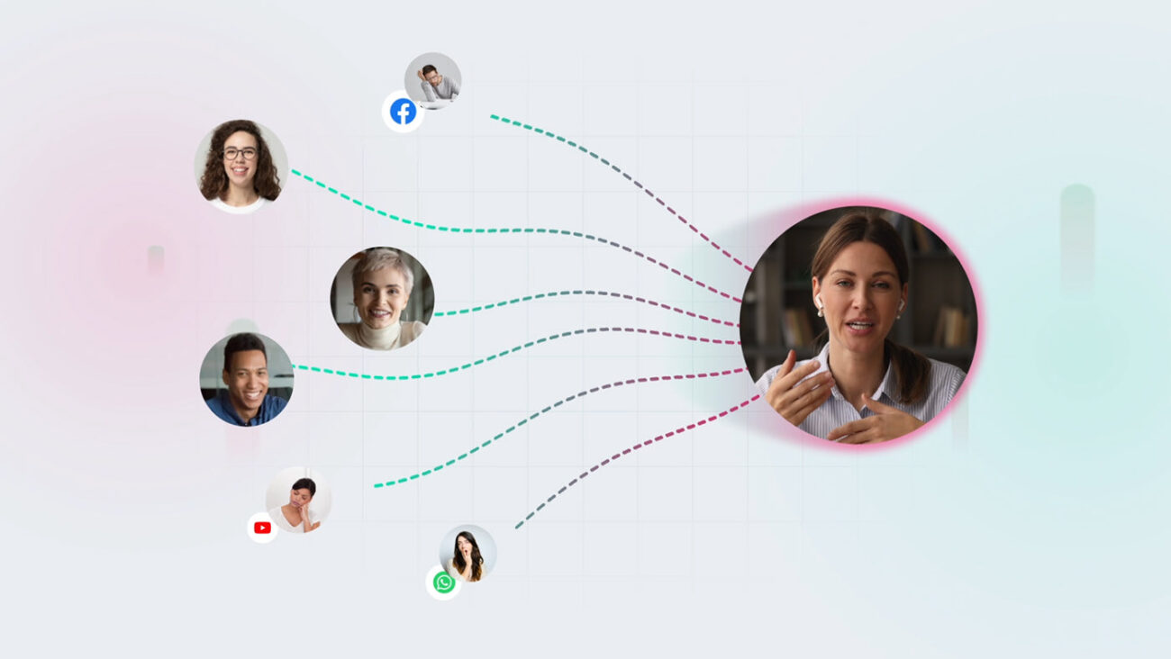
Client wanted a video that could relate to the ongoing engagement issue faced by educators and leaders of educational institutions during online classes.
Lens, an online teaching powerhouse, keeps the learners engaged, gauges the performance of your live classes, and increases retention rates.
challenge
To promote Lens as the groundbreaker of online sessions with its advanced tools while highlighting how easy it is to use the platform. A dynamic video that simplifies the product!
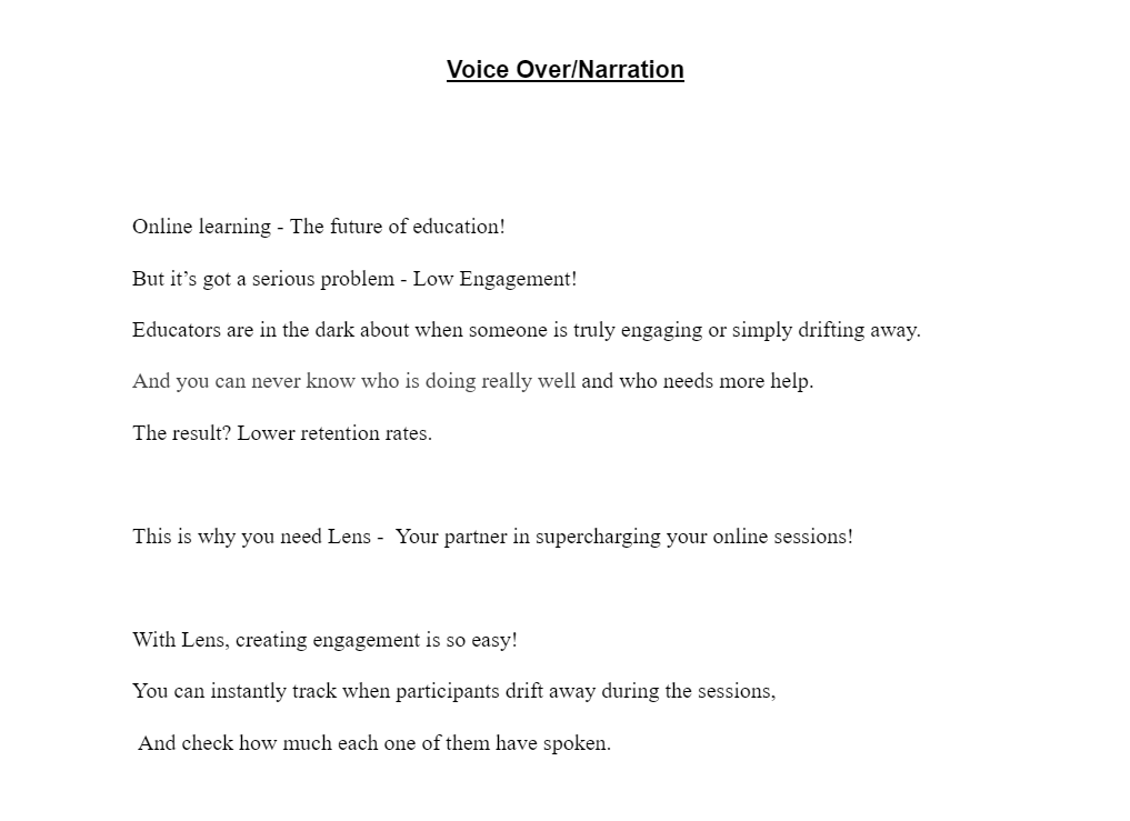
Script
We wrote a script with a direct approach, mixing casual with professional tonality for greater engagement and relatability. Afterall a product driving engagement surely needs an engaging video!
Use of shorter sentences brought dynamic pace and hooking keywords helped in grabbing attention to the exciting features.
Storyboard
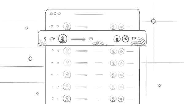
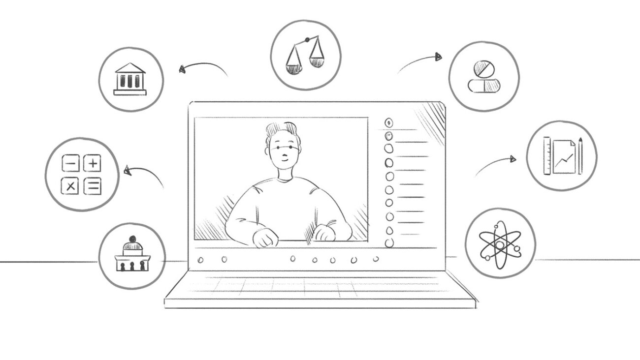
For any SaaS video, success massively relies on in-depth understanding of the product. And we ace in prioritizing the features that truly transform the lives of users.
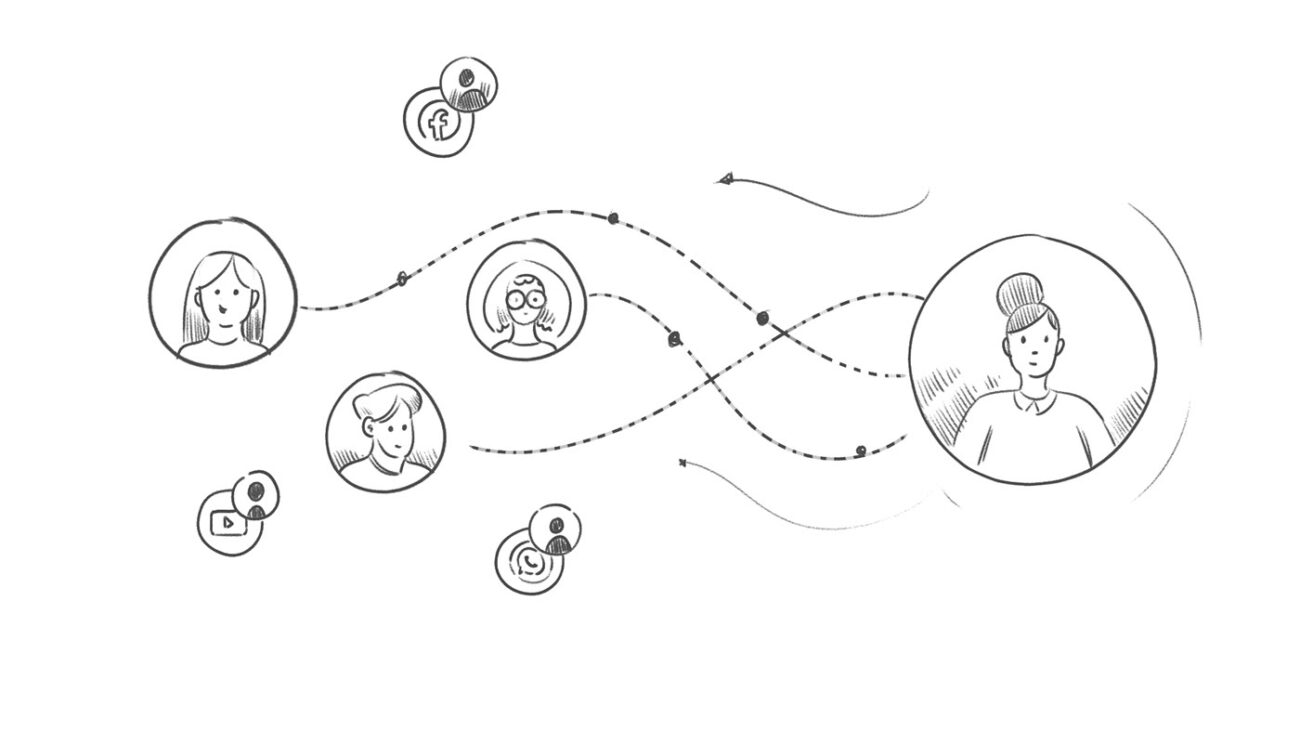
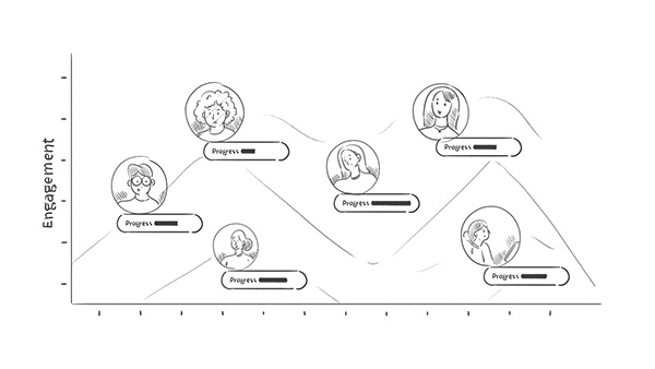
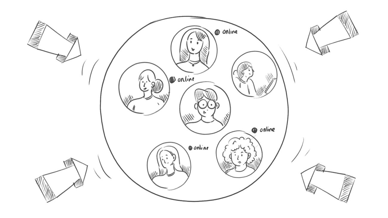
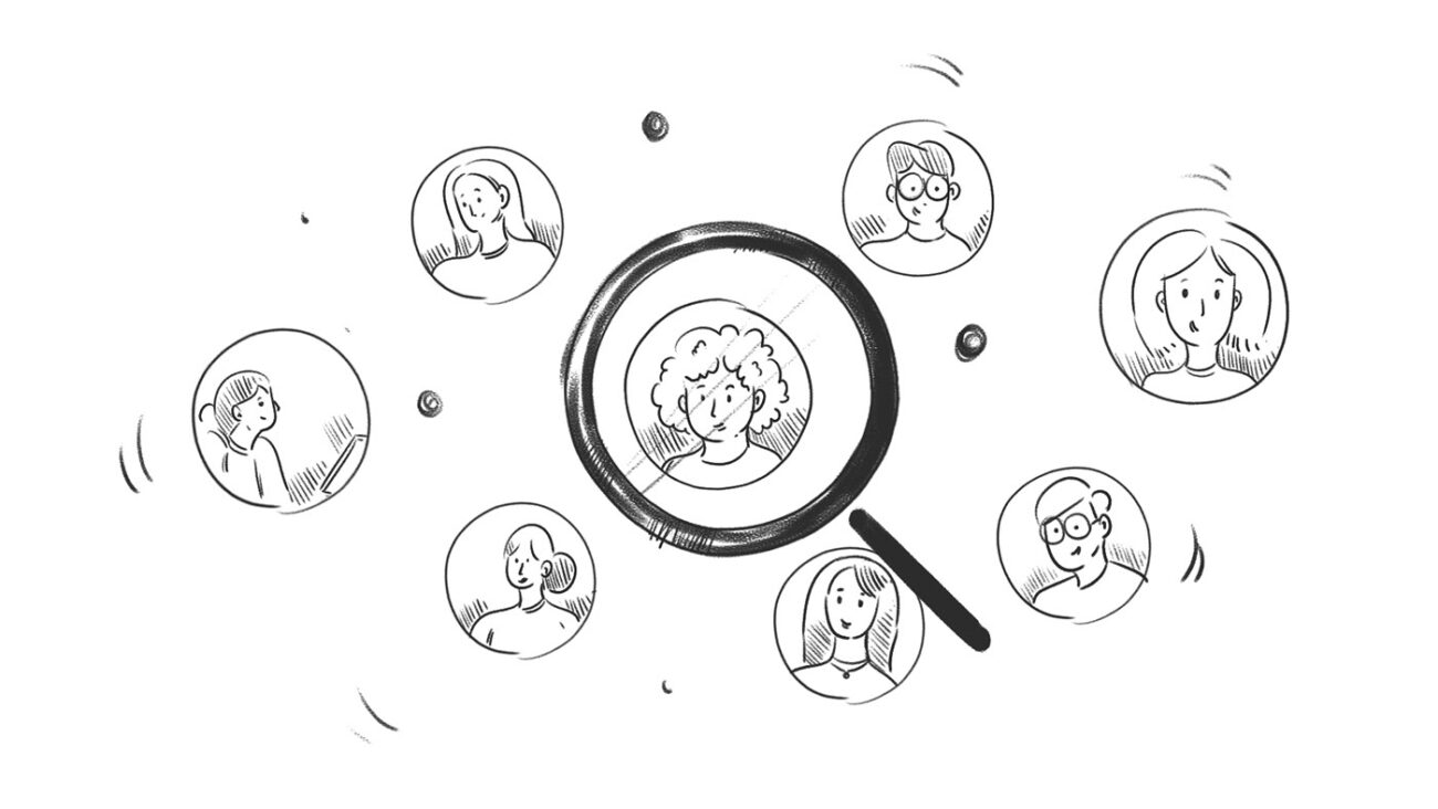
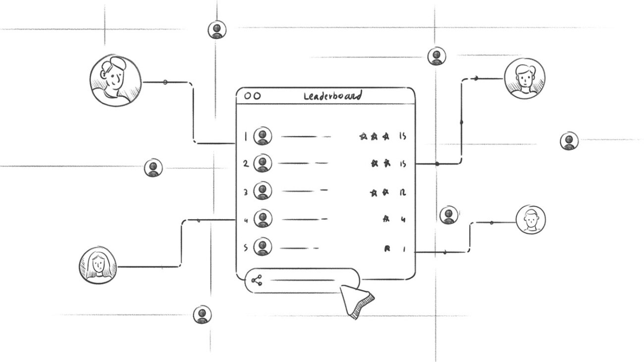
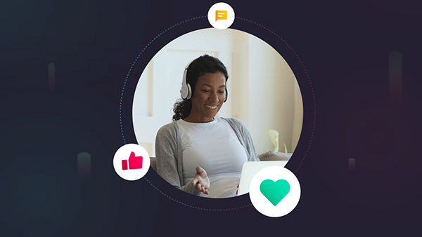
Because we were aiming for the education sector, we favored the strategy of using characters and people to evoke empathy and a sense of connection.
Style options
Style 1
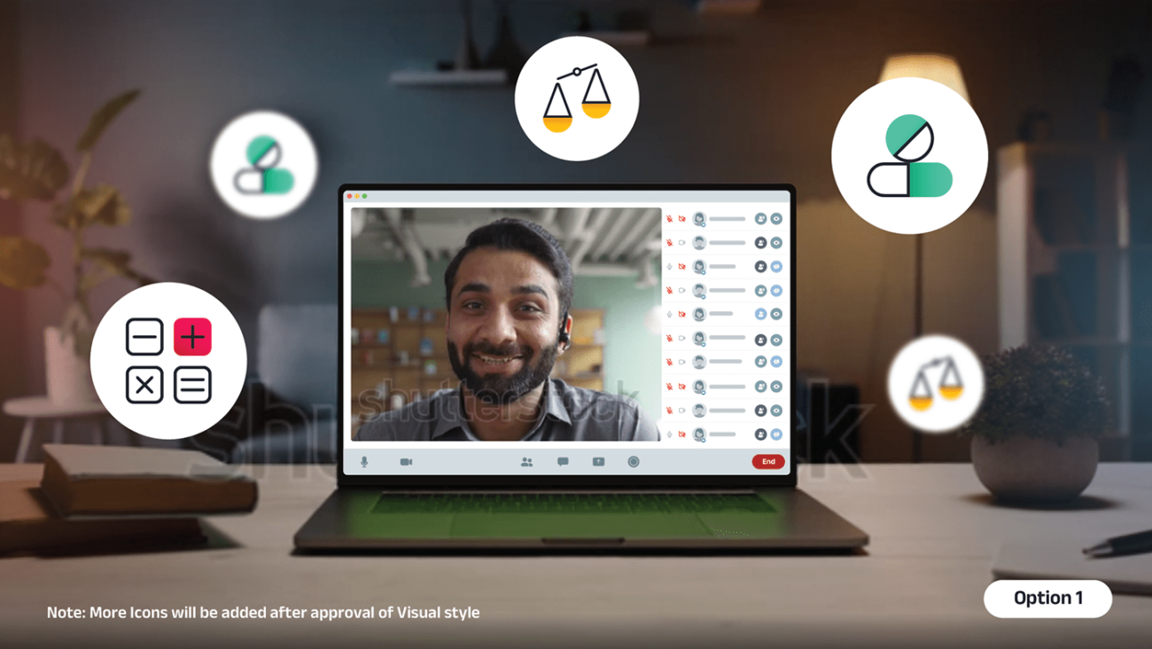
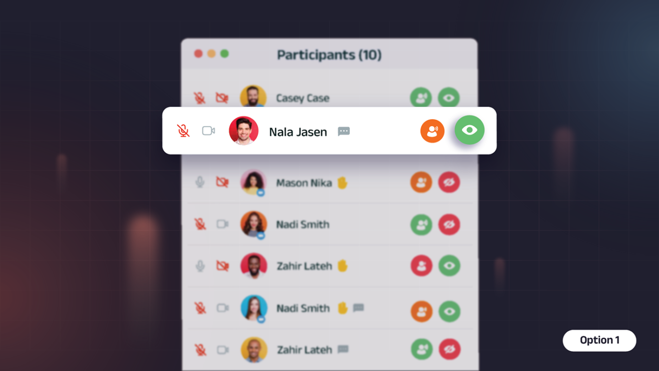
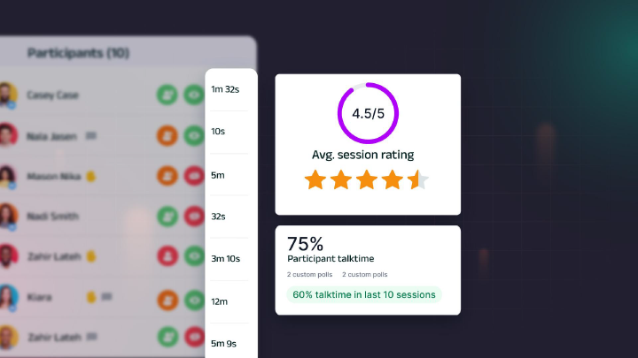
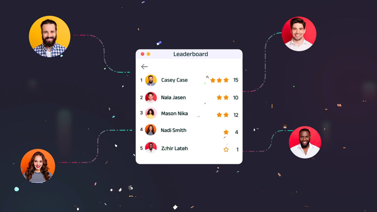
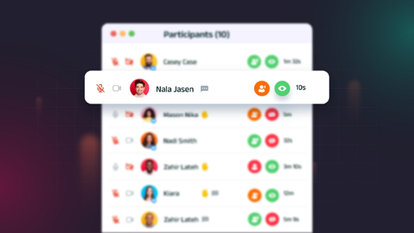
A line art icon style filled with soft pastel colors merges with a darker background that is highlighted with mild strokes of gradients to pop up the elements while maintaining elegance and professionalism. In this style, we revamped the UI by adding vibrant colors to the primary features.
Style 2:
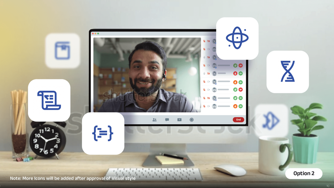
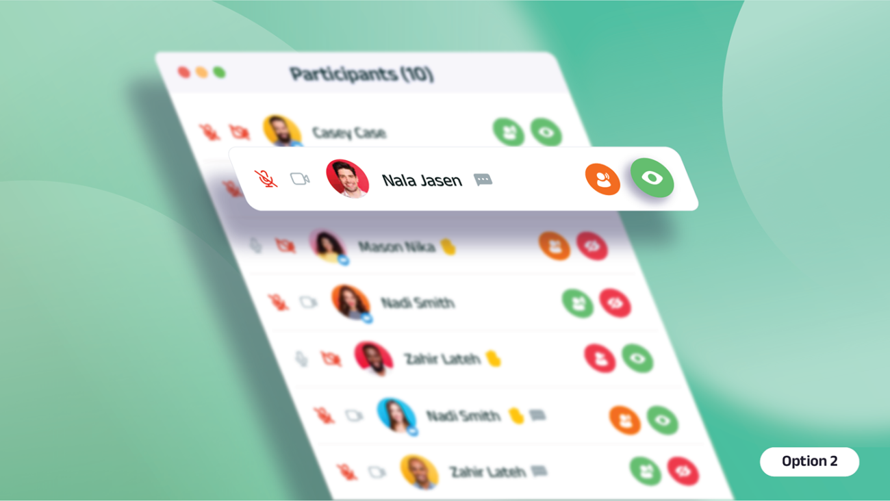
A minimalistic and modern line art icon style with popped up elements bursting against a light, pastel colored background to bring freshness and playful tone to the video. In this refreshing theme, we created the UI representation in a perspective style to drive a futuristic 3D feel.
Our client loved both the styles but decided to go with Style 1 to stay consistent with their complete branding.
Style Frames:
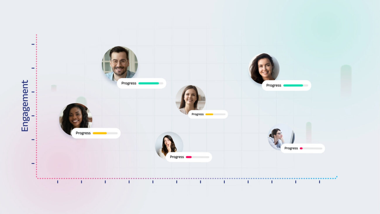
All design frames were created following Style 1. The frames danced between darker and lighter backgrounds to maintain dynamism- a key to keeping the audience hooked throughout.
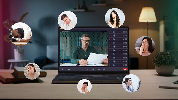
Finding the right stock footage was a big part of the challenge to bring the desired richness and our research was seriously extensive!
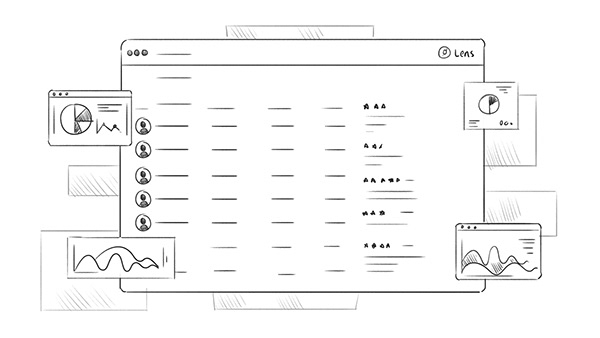
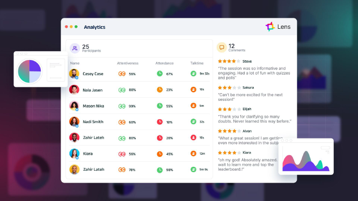
We cleaned the original UIs and enhanced the elements to maximize the visual appeal and sharpness of messaging. Afterall, a focused UI never misses the target in a video!
Animation:
With an amazing Designboard combined with strategically driven Voice Over & Music, it was a cake walk for our animation team.
This is why we follow a process where we examine every idea at each stage and involve our clients in every decision. It completely aligns us all and helps us work towards the same vision. No last minute surprises, no creative silos!
With a clear understanding of the product, our team exactly knew what to highlight in UI and how to drive the problems home.

When the final video was presented to the client, they were mindblown by not just our creativity but our attention to detail and ability to translate ideas that felt effortless.
And for us, it was time to clink our glasses and celebrate another sparkling success!

