Brief
Clari approached AissaMotion to create a next-level explainer video for the home page of their newly re-designed website. The initial question was 2D or 3D? What style of animation would tell the story best with visuals that compliment the narrative instead of distract from it? 2D with simple 3D elements was the consensus.
Clari’s creative team wanted to take elements from their new branding pack and use graphics, typography, and live action to tell the story. The motion was to be refined but not overly playful.
In the creative brief, Clari made it clear of the most important objective of this film: That anyone watching the film understands what Clari is and what it’s used for.
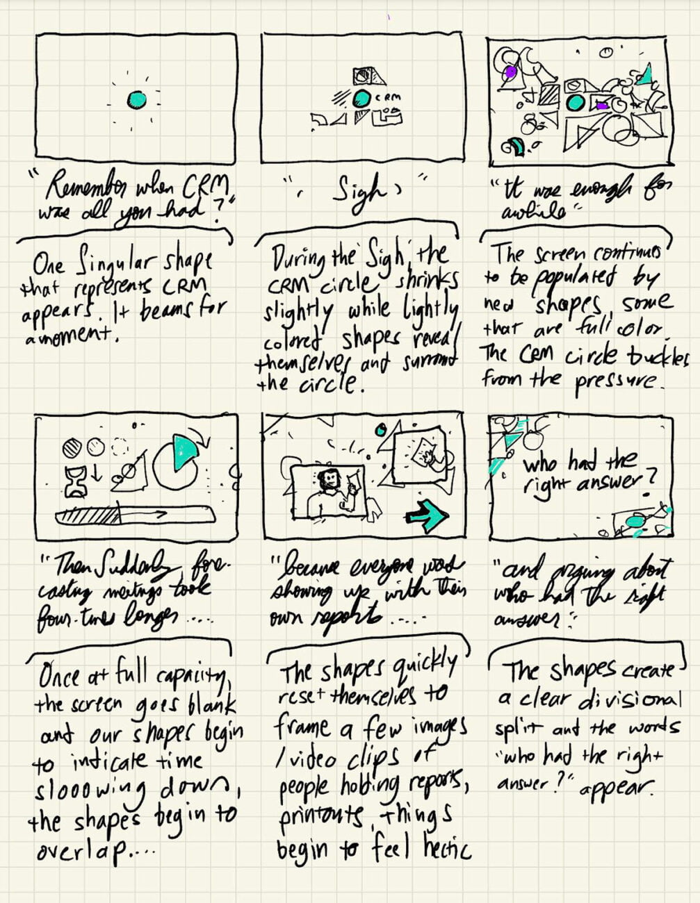
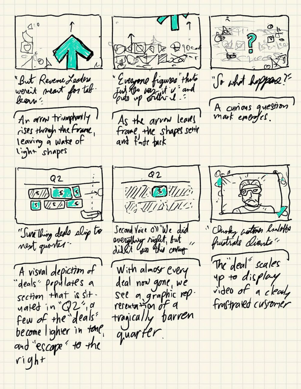
One of the biggest challenges in creating custom animation films is making sure everyone is on the same page in terms of vision from storyboard through final animation. Thankfully, Clari has an A+ creative team that helped us define the style early in the workflow. Creative Director Ian Ashenbremer created a beautiful v1 storyboard to get the ball rolling.
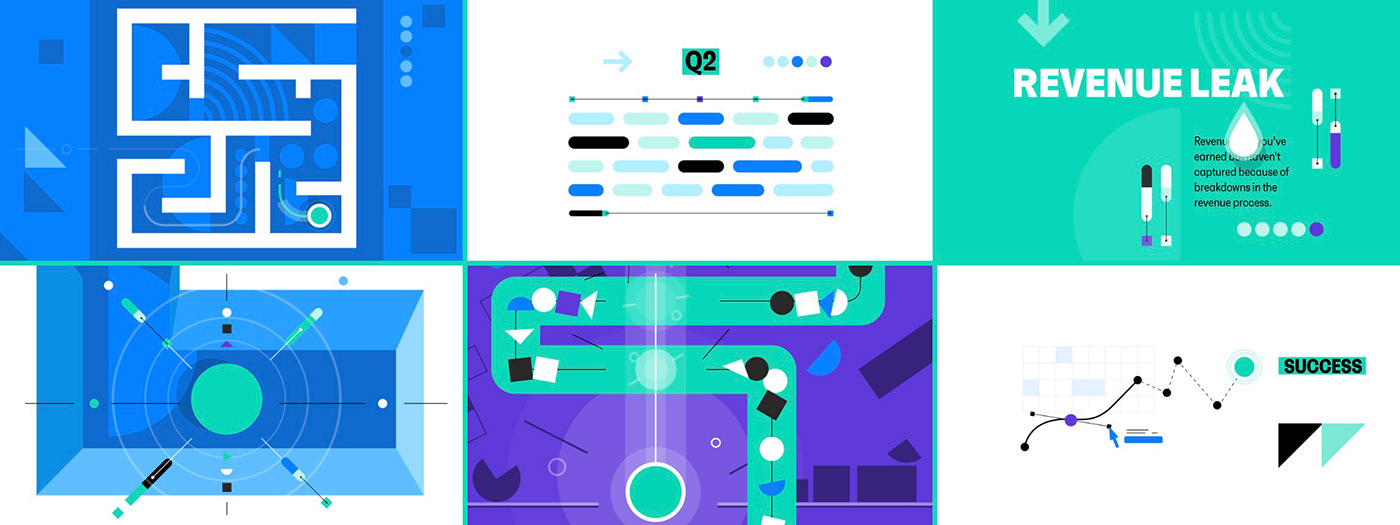
AissaMotion collaborated with Clari Inc. to create the new brand film for the tech companies website.
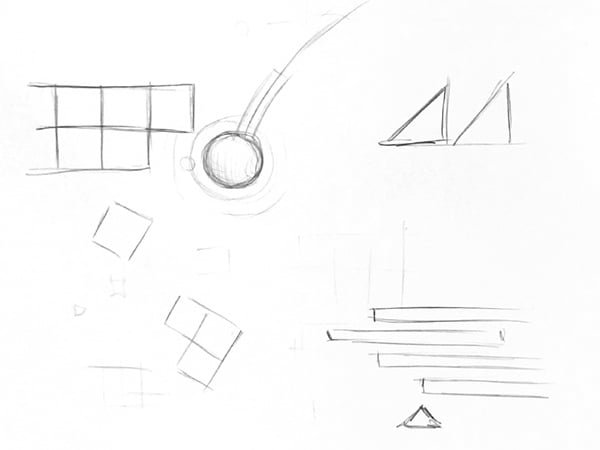
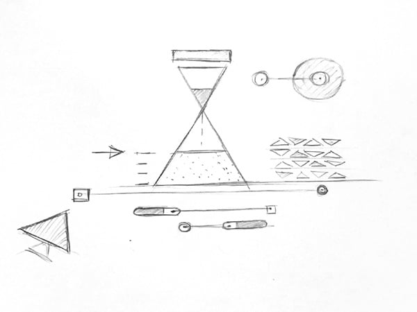
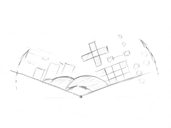
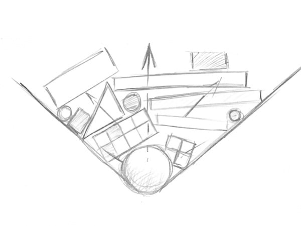
Our team took the v1 storyboard and began to flush out the ideas with a pencil and paper:
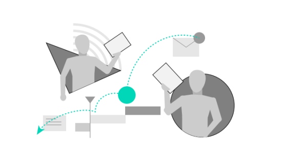
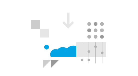
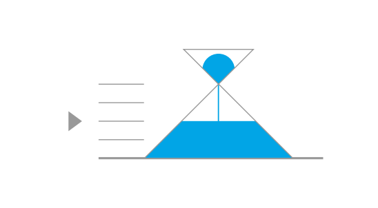
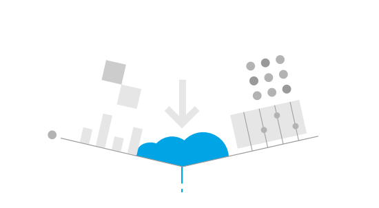
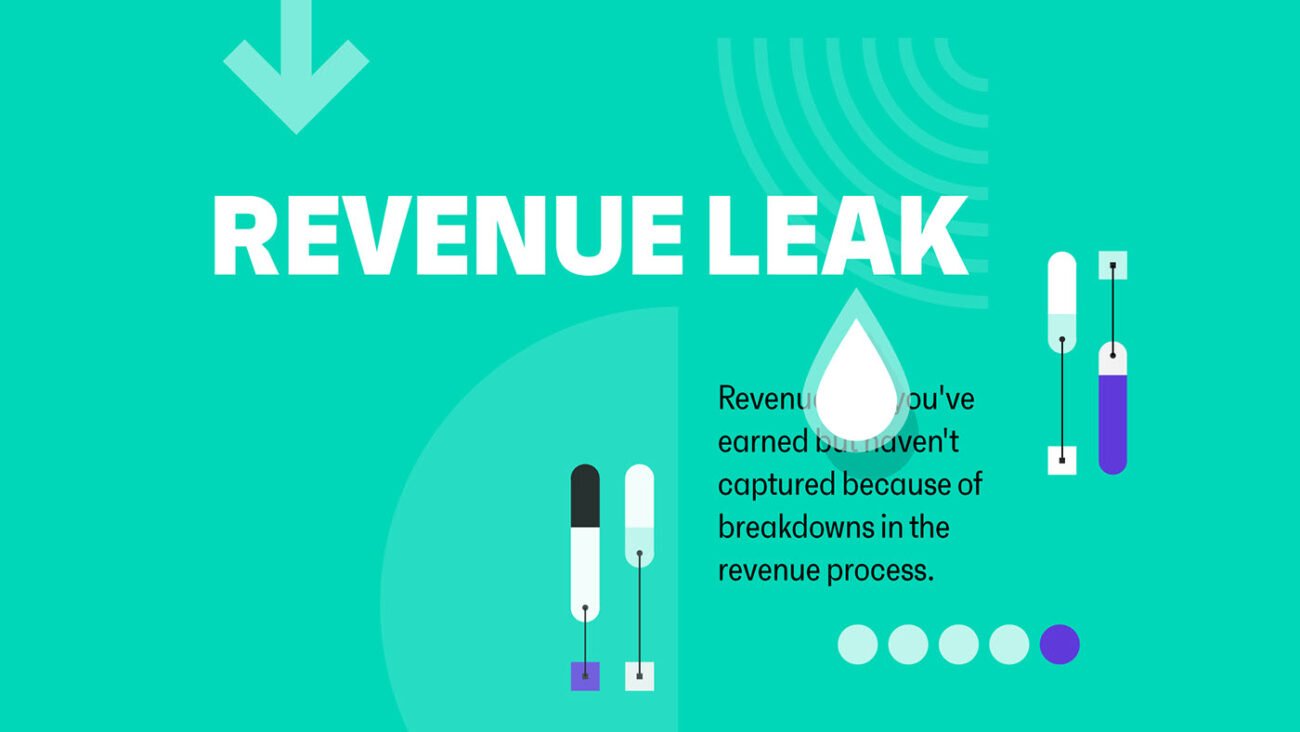
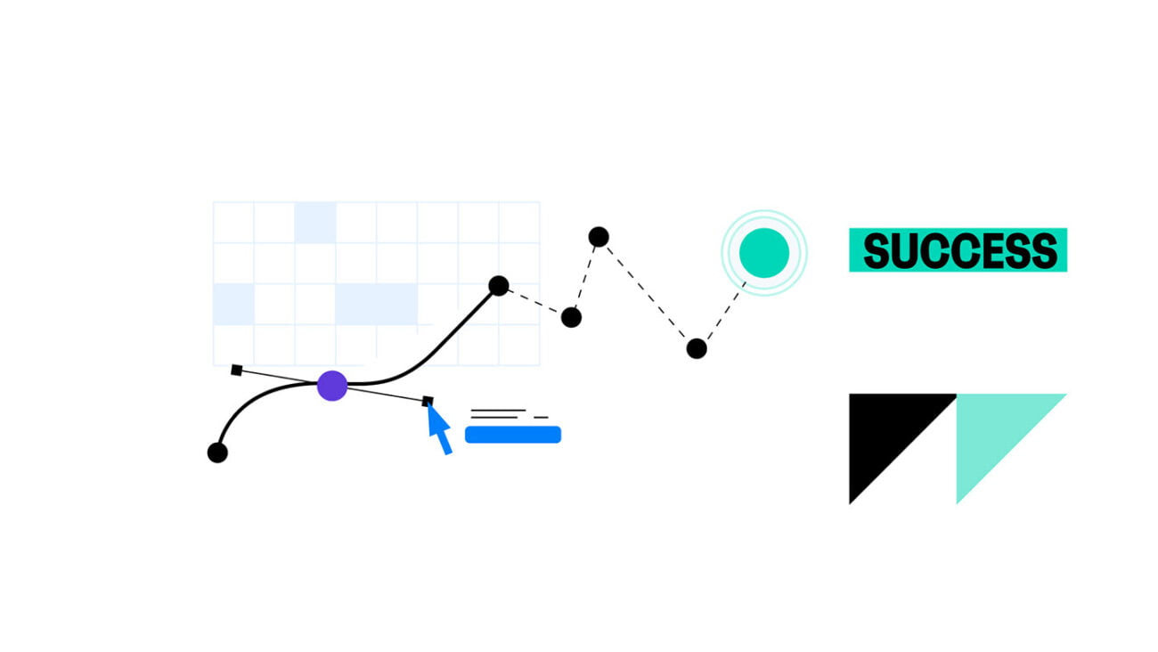
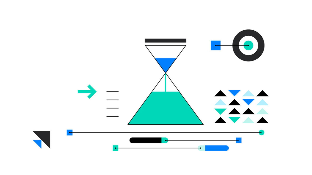
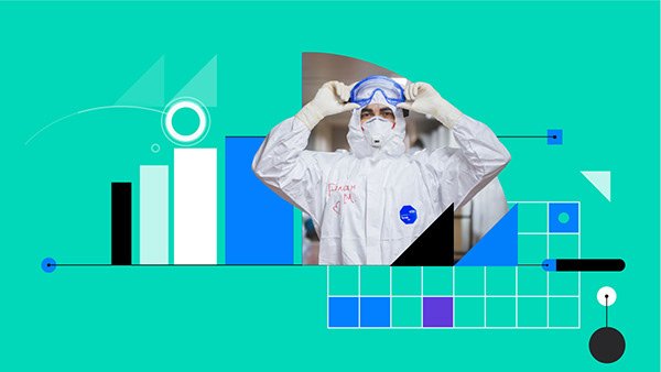
Having a clear storyboard from Clari was a huge win for the entire collaboration. AissaMotion took the initial storyboard from Ian and flushed it out one more level by bringing it from drawing to simple digital illustrations. Below you can see some frames from the v2 storyboard.


